There is a particular pleasure in opening a new sample book. The fabrics fan open, colors begin to emerge, and suddenly a project that existed only as an idea starts to feel tangible. You notice a pattern, then a texture beside it. You pull one fabric toward another and begin to imagine what they might become together. Before the room is fully designed, there is already something to work with.
That feeling is where Kindred begins.
Anna Elisabeth's newest collection brings together four books—T25 Driftwood, T24 Bramble, T23 Heron, and T26 Ember—each with its own distinct color story, all connected through a shared collection. Four books, one thread, every room. Rather than presenting four separate directions, Kindred gives designers a way to move through color, pattern, and texture while still finding relationships between them.
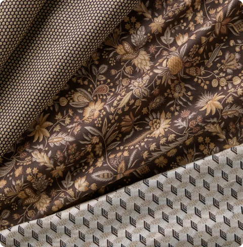

Four Palettes, One Shared Thread
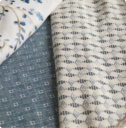
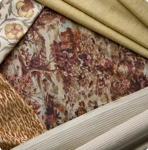
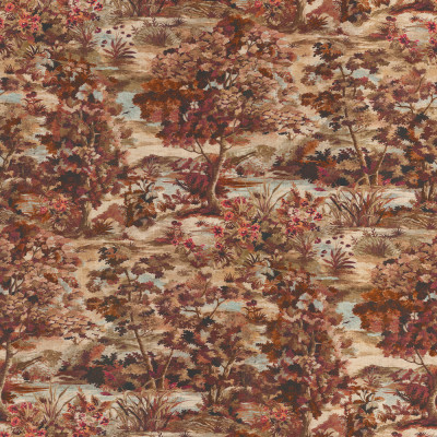
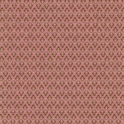
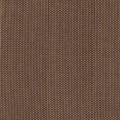
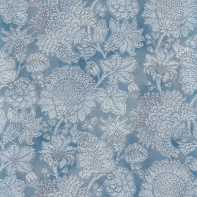
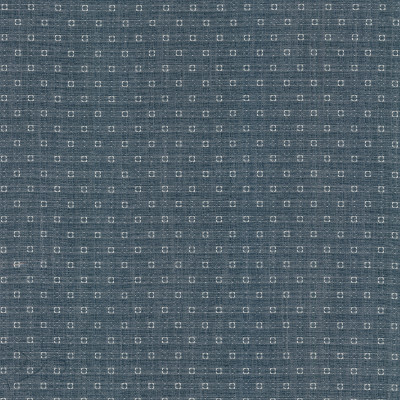
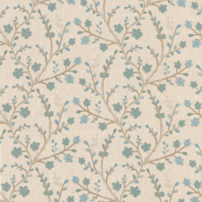
Each Kindred book has its own personality. Driftwood moves through warm neutrals of cream, bone, taupe, and sand, creating a quieter foundation for a room. Bramble brings layered greens, from moss and sage to fern and forest, with a feeling that is deeper and more enveloping. Heron moves through soft blue, indigo, slate, and dusty denim, while Ember brings warmth through rust, terracotta, ochre, plum, and pink.
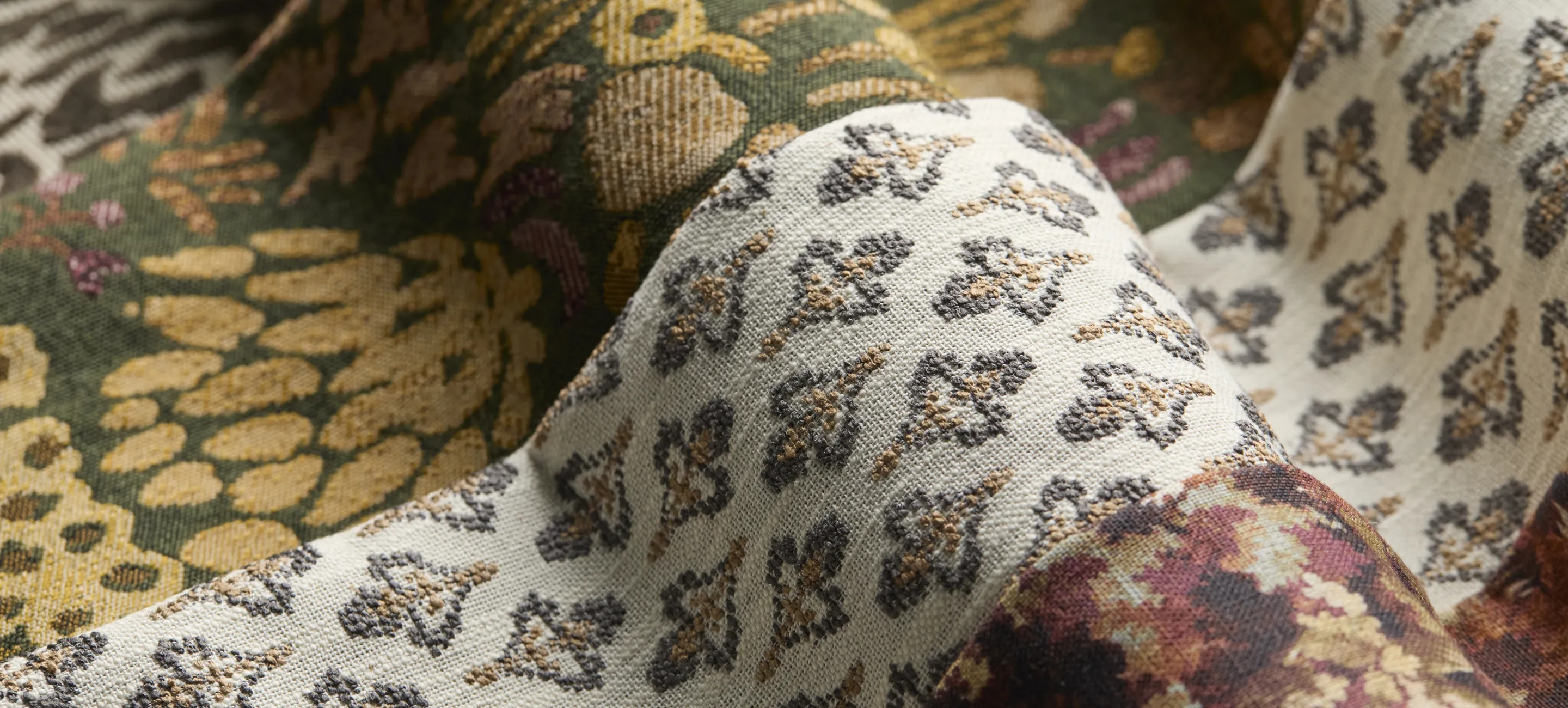
The palettes are different, but they were designed to feel related. A pattern that appears in one book may appear again in another, changing character as the color changes. A floral can feel soft and restrained in one palette, then become richer or more expressive in another. A stripe can move from quiet to dramatic simply by changing its surroundings.
That shared language is what gives Kindred its flexibility. A designer can begin with the palette that feels right for the project without feeling confined to it. The color establishes the mood, while the recurring patterns create a thread that makes movement between palettes feel natural.
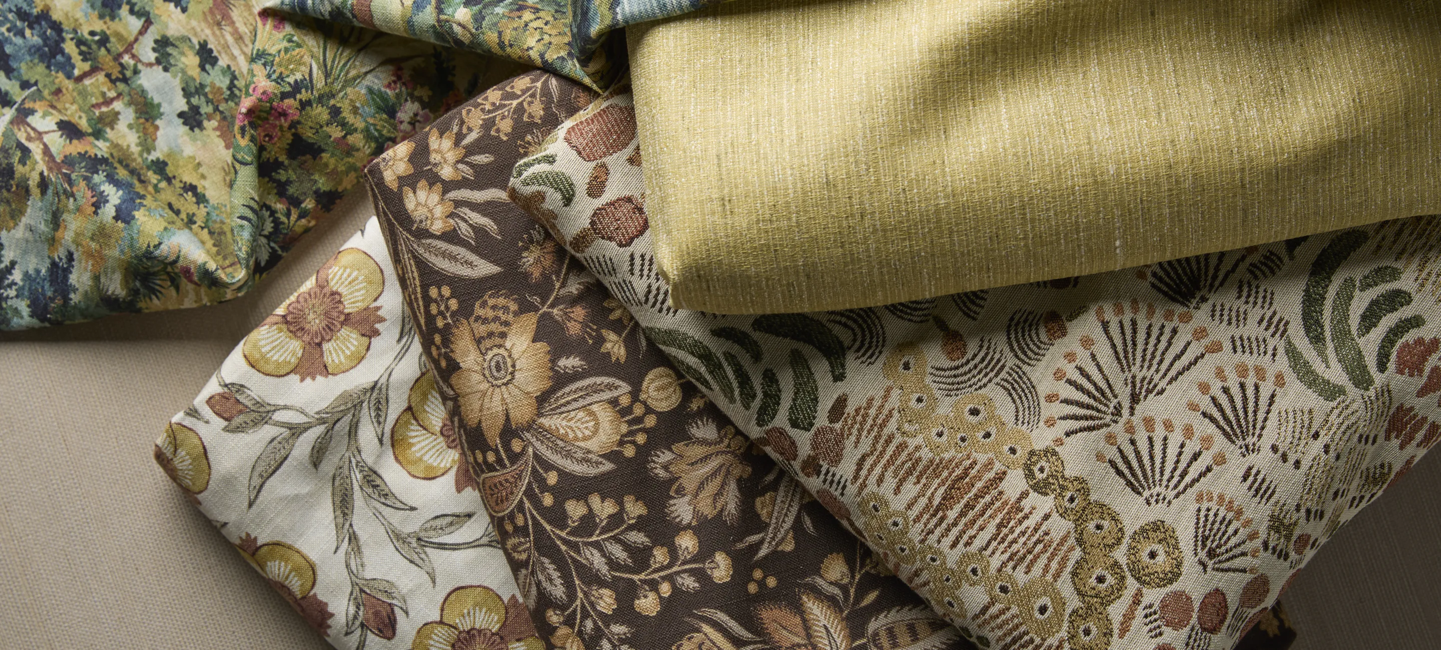
A Fabric Library With a Point of View
The usefulness of a fabric book isn't simply in the number of fabrics it contains. It's in what happens when those fabrics are considered together.
Each Kindred book brings more than thirty fabrics across prints, wovens, embroideries, velvets, stripes, plaids, animal prints, and multipurpose textures. That range matters because a room rarely asks one textile to do everything. One fabric may establish the visual direction, another may bring texture, and another may introduce contrast.
Instead of beginning with an endless assortment of unrelated choices, designers can begin with a collection where those relationships have already been considered.
That doesn't mean every fabric needs to be used together, or that Kindred is meant to prescribe what a room should look like. Quite the opposite. The collection gives designers a thoughtful starting point, then leaves plenty of room for interpretation.
When the Fabric Starts the Room
There is value in having a place to begin.
Maybe it's the pattern you weren't looking for but can't stop thinking about. Maybe it's a texture that makes the palette feel warmer. Maybe it's a color that immediately reminds you of the client, the architecture, or the feeling you want the room to hold.
From there, the process becomes less about searching for something that matches and more about finding what belongs.
That's where a curated fabric book can change the experience of sourcing. Instead of asking, What goes with this? you can begin asking, What happens if I put these together?
The difference is subtle, but it creates more room for discovery. Kindred brings those possibilities together in one place, giving designers the freedom to build a room that feels layered and personal without having to build every relationship from scratch.
Designed to Become Something of Your Own
The most compelling interiors rarely feel as though every decision came from the same place. They feel collected, personal, and a little unexpected. That's the spirit behind Kindred.
The four books aren't intended to create four different versions of the same room. They're meant to give designers a range of starting points and the freedom to move between them. The shared patterns create familiarity, while the different palettes leave room for the designer to change the mood entirely.
And that's where the name Kindred feels particularly fitting. These fabrics don't need to match to feel connected. They simply need to share enough of a language that the designer can bring them together in a way that feels natural.
The Joy in Your Hands
Kindred gives each palette room to unfold. Within the warm neutrals of Driftwood, the layered greens of Bramble, the blues of Heron, and the warmth of Ember, designers can discover different ways to build depth, contrast, and personality without losing the thread of the palette. A pattern may catch your eye first, then a texture beside it. One fabric leads you to another, and suddenly the color story begins to take shape in a way you hadn't anticipated.
That's the pleasure of working with a thoughtfully curated color book. The direction is there, but the possibilities within it are yours to discover. Kindred was made for that moment.