Fall has a way of changing the way a room feels.
Not because the design conversation suddenly changes, but because the season encourages us to experience it differently. The ideas shaping interiors—greater depth, more tactile materials, thoughtfully layered pattern, and nuanced color—don't arrive with the season. They simply feel especially at home in it.
You've probably felt it start already, in the pieces you're drawn to and the palettes that have started to feel a little flat.
Color Is Getting More Nuanced
The color moving through this fall isn't simply getting darker; it's getting more complex.
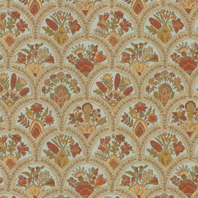
Green is showing up with depth rather than brightness. Reds are moving toward wine and earthy variations. Neutrals are warming up with olive, mushroom, taupe, and brown undertones.
That nuance is where fabric starts to matter, because a color that reads one way on a screen can reveal an entirely different personality once it's woven or layered into a room.
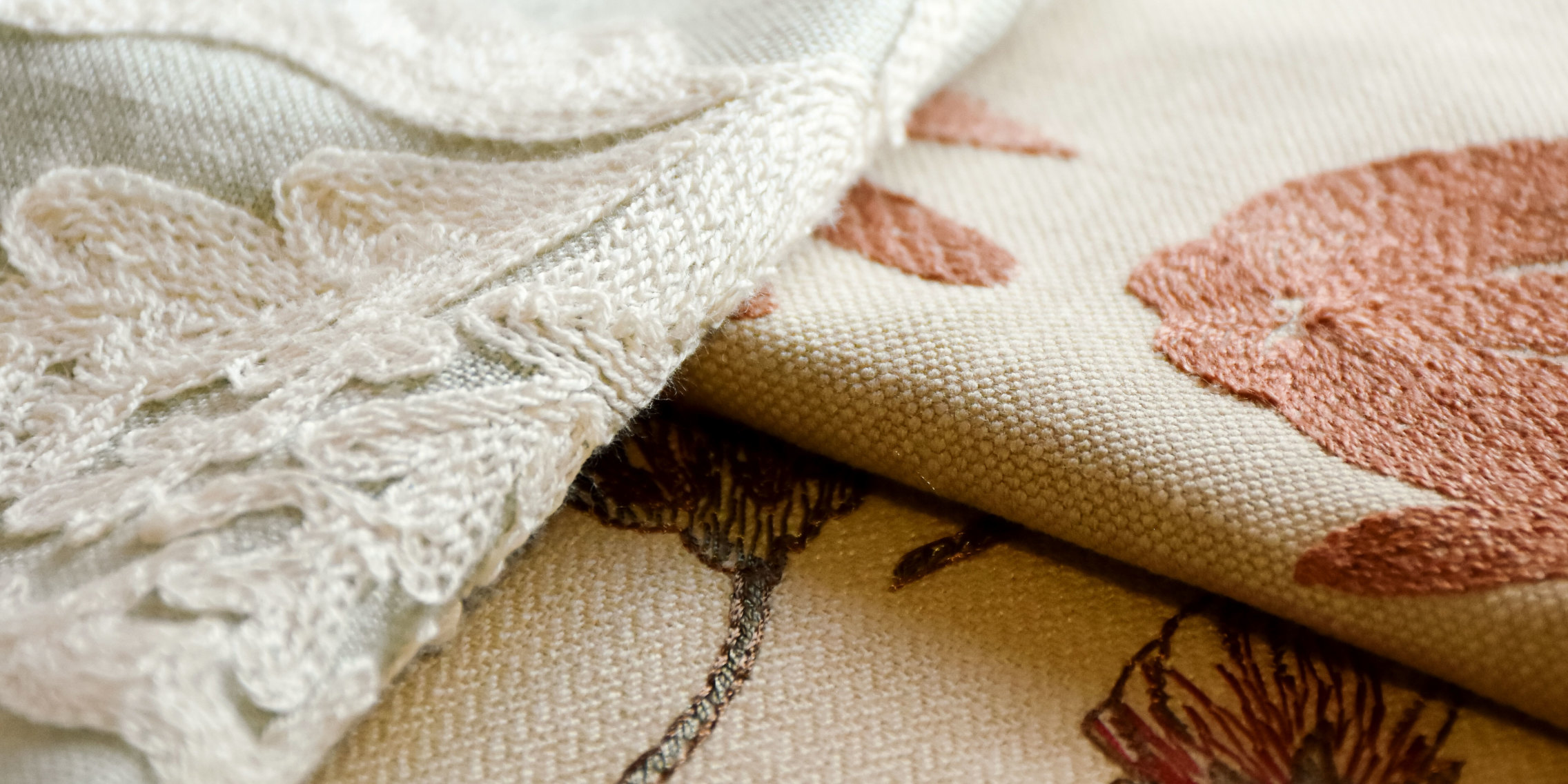
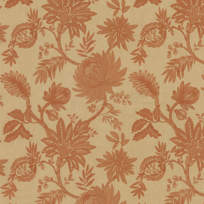
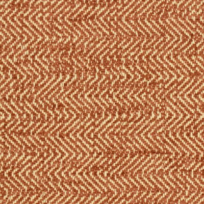
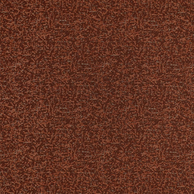
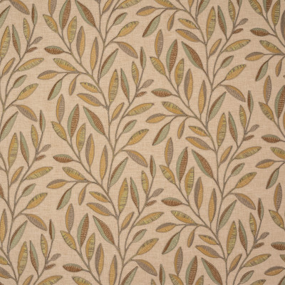
Take S7898 Rust from T19 Heirloom Embroidery. The rust and neutral palette feels distinctly grounded, but the embroidered surface gives the color another layer to discover. With an 18-inch horizontal by 19-inch vertical repeat, the pattern has room to unfold rather than simply read as a block of color.
A warm neutral can turn almost mineral beside a cool blue, and a deep green can pull olive, bronze, or gray depending on what surrounds it.
Color doesn't have to announce itself to change the feeling of a room. Sometimes the most interesting shift is the one you notice only after you've lived with it for a moment.
Texture Brings the Room Closer
If color is the change, texture is where it lands.
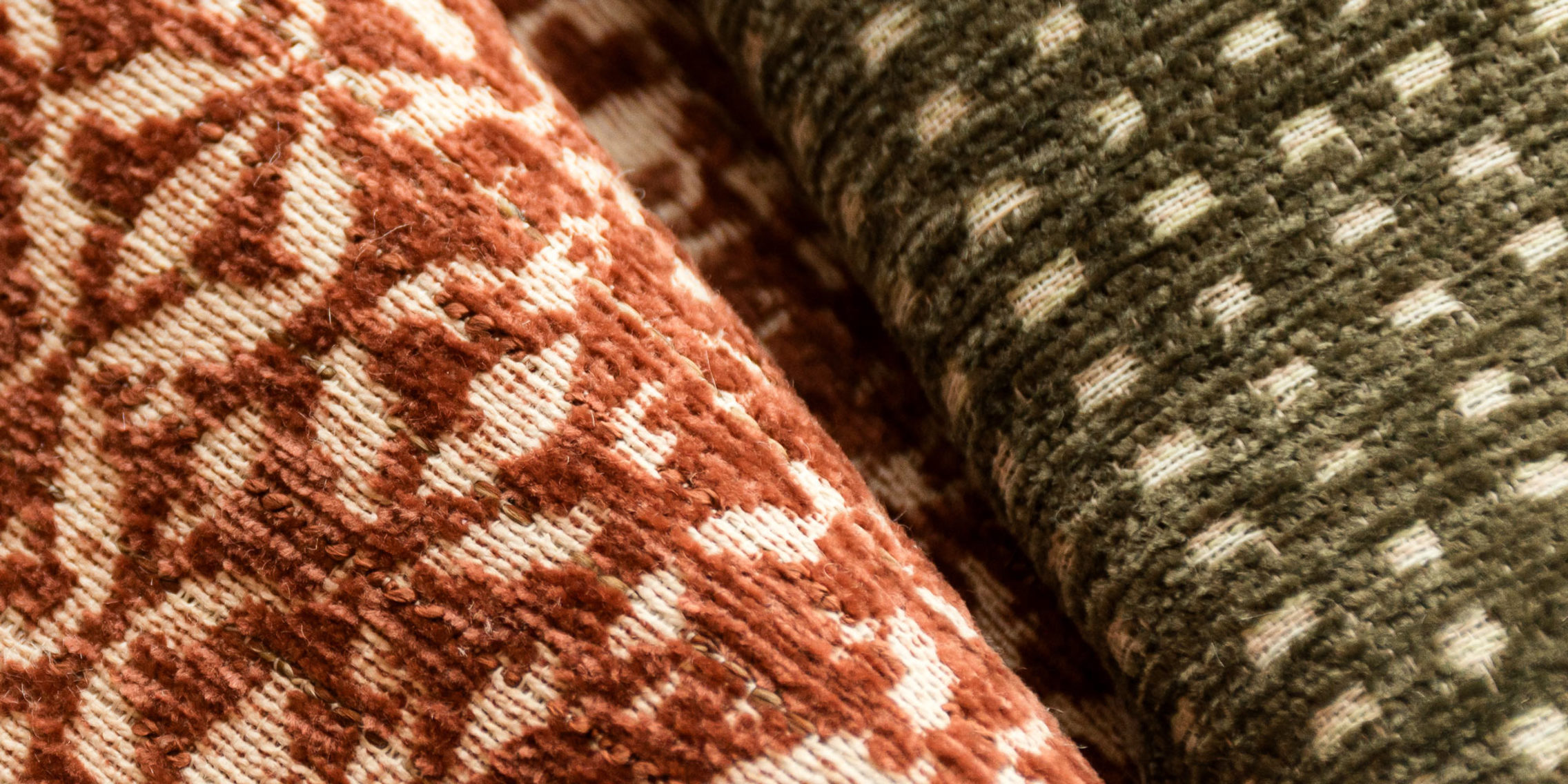
Tactile surfaces are doing quiet, steady work this season: textured linens, open weaves, embroidered surfaces, and velvet with enough dimension to reward a closer look.
There’s something particularly effective about texture because it works at two distances: Across the room, it creates depth. Up close, it gives you something to discover.
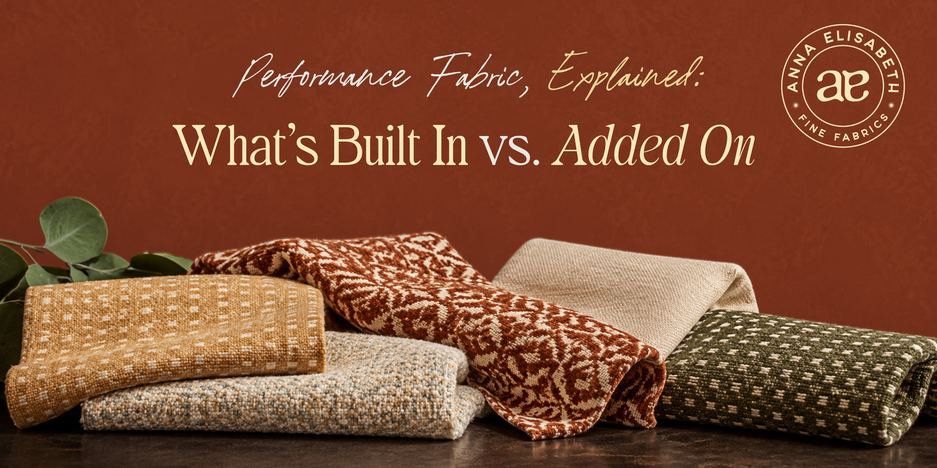
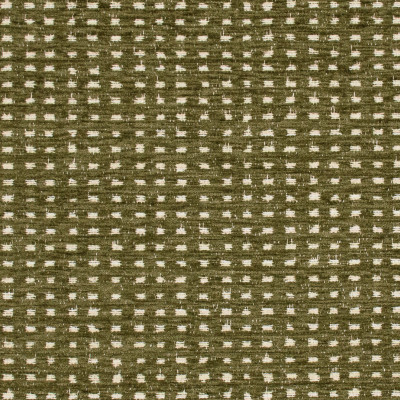
S7951 Grove from T22 Crypton Textures is a good example. Its small-scale pattern and textured surface bring dimension to the green palette without asking the fabric to become the loudest thing in the room. The 6.75-inch horizontal by 8-inch vertical repeat gives it enough movement to be noticed, while still leaving room for the other textiles around it.
A dimensional weave can make a quiet color feel considerably more alive, which means richness doesn't always call for another loud element. Sometimes a room doesn't need more color so much as more surface.
Pattern With a Point of View
Pattern is moving in the same direction, toward something more layered and personal.
We're seeing florals, stripes, plaids, botanicals, and more expressive motifs used together rather than treated as competing choices. They’re held in place by a shared color story, a range of scale, and a few moments of visual rest to keep a layered room feeling intentional rather than busy.
That opens up a lot of possibilities for textiles.
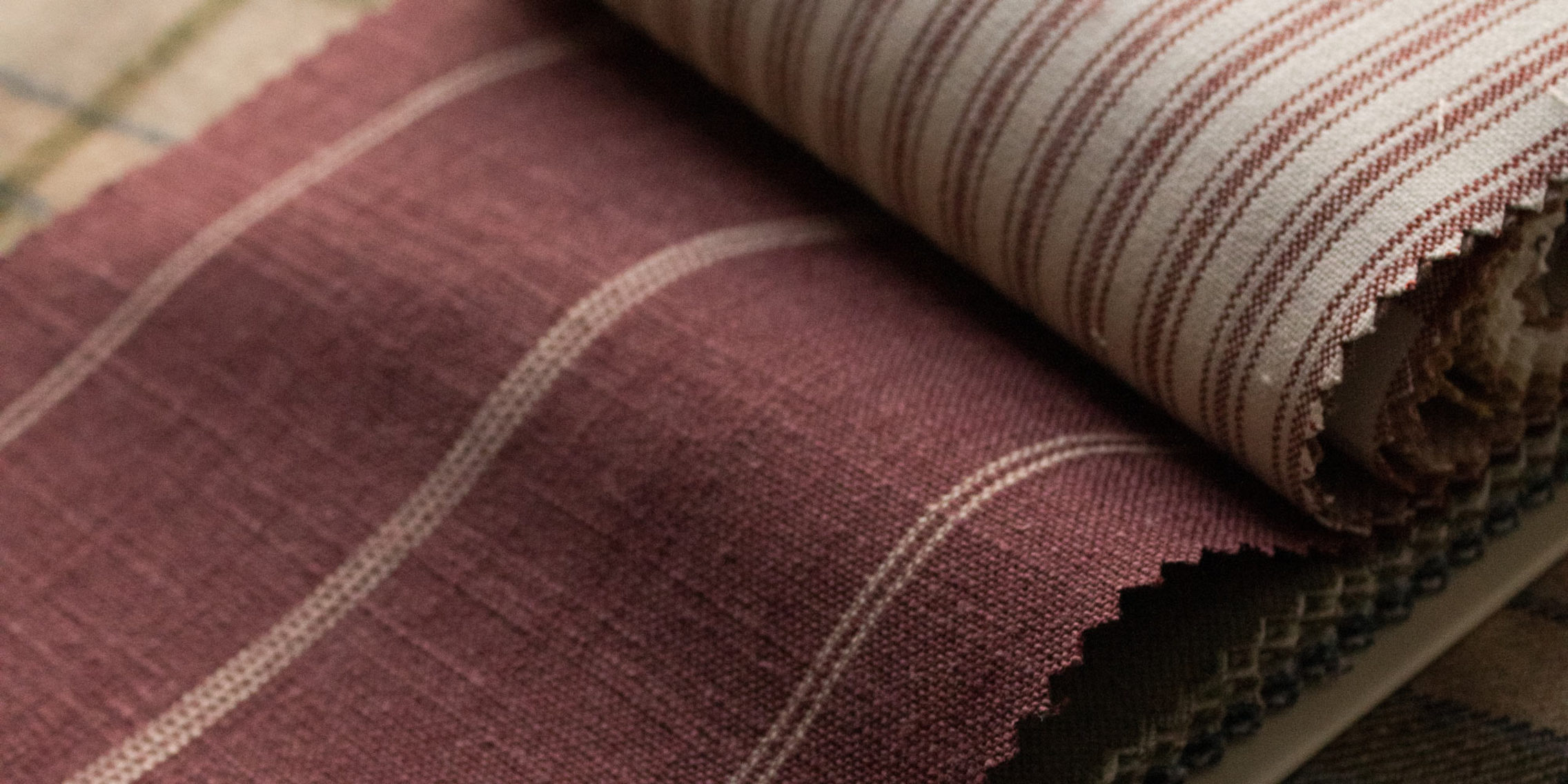
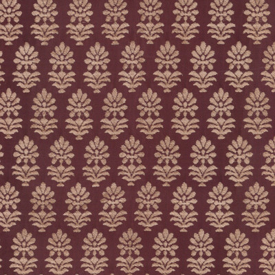
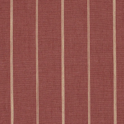
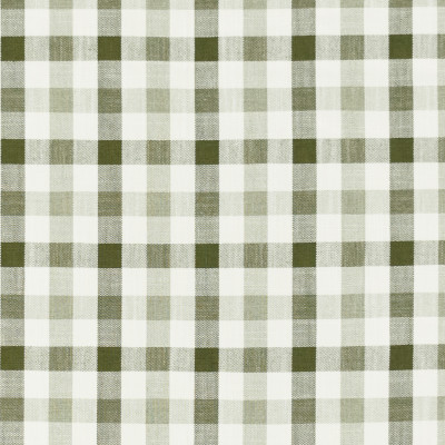
S7916 Currant from T21 Classic Stripes & Plaids is a good example of how a familiar pattern can bring structure without taking over. Its rich red tone gives the stripe a distinctly fall feeling, while the 5.37-inch horizontal repeat gives the eye somewhere to settle.
A large botanical can become the visual anchor. A stripe can give the eye somewhere to settle. A smaller print can add movement without competing for attention. A textured solid can create the pause that lets everything around it breathe.
The result doesn't have to be maximalist — it can simply feel more considered.
You may have noticed this shift happening already: pattern not necessarily being used to make a room louder, but to make it feel more lived in.
Where Old and New Meet
Running underneath all of it is a renewed appreciation for things that feel familiar paired with shapes and details that feel current.
The result isn't a return to one particular period. It's a conversation between them.
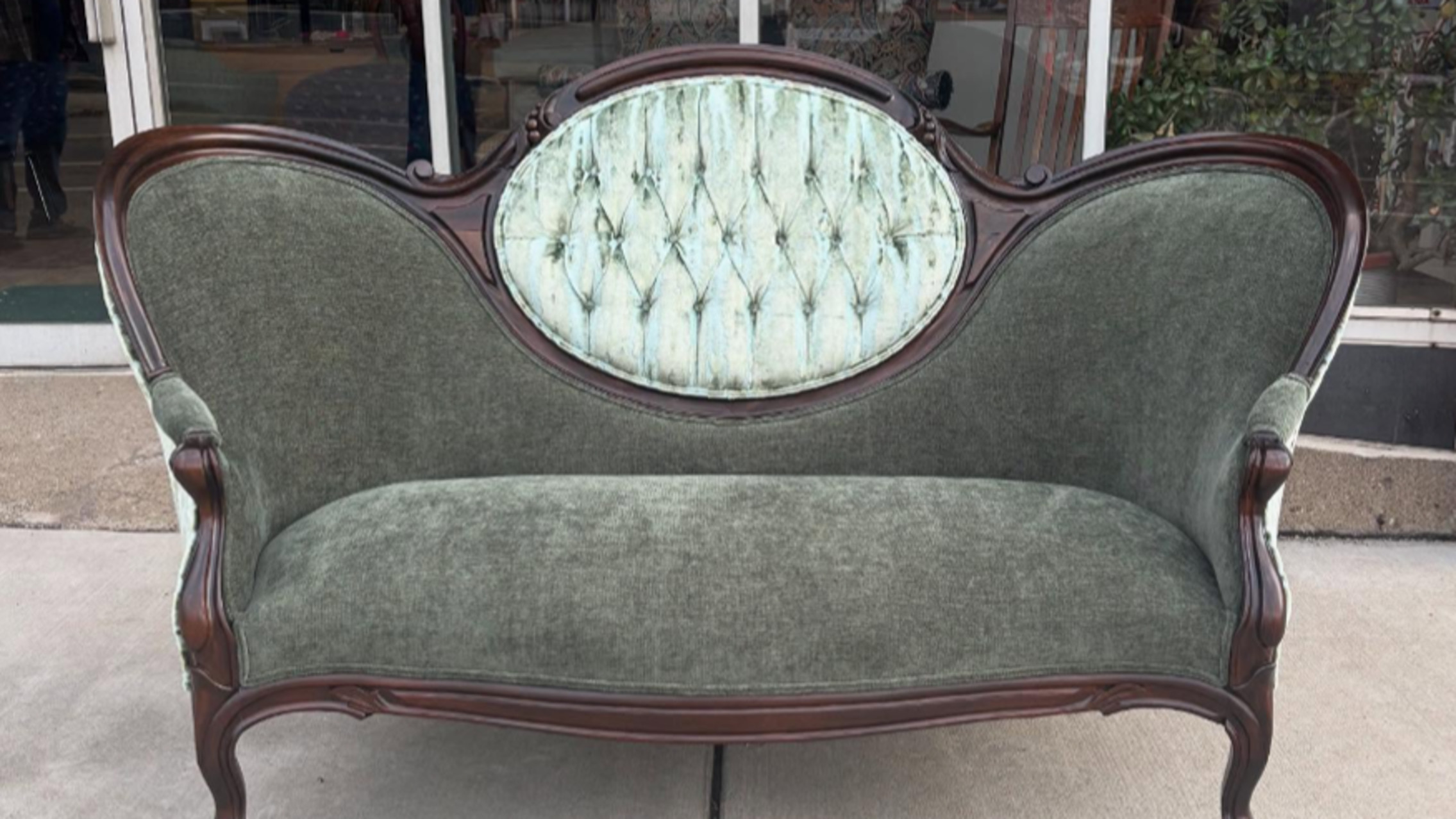
A heritage-inspired motif can feel completely different on a modern silhouette, a traditional stripe can sharpen a contemporary chair, and an embroidered textile can soften a room built on cleaner lines.
The interesting part isn't choosing old or new — it's seeing what happens when they meet.
When the Fabric Leads
Taken together, these shifts speak to something more lasting than what's new this fall.
Color is becoming more nuanced. Texture is becoming more important. Pattern is being layered with greater intention. Traditional references are finding new life beside contemporary ones.
That makes this a good season to look at fabric a little differently—not as the final layer added once the room is already decided, but as one of the first materials that sets its mood.
A fabric can bring the depth a palette is missing. It can soften a harder architectural line. It can introduce pattern without overwhelming the room. It can connect a vintage piece to everything around it. And sometimes, it can be the thing that makes the whole room suddenly make sense.
The best part of watching a season unfold is deciding what is worth carrying forward. But the right color, texture, or pattern can give a room a feeling that lasts much longer than the season it came from.