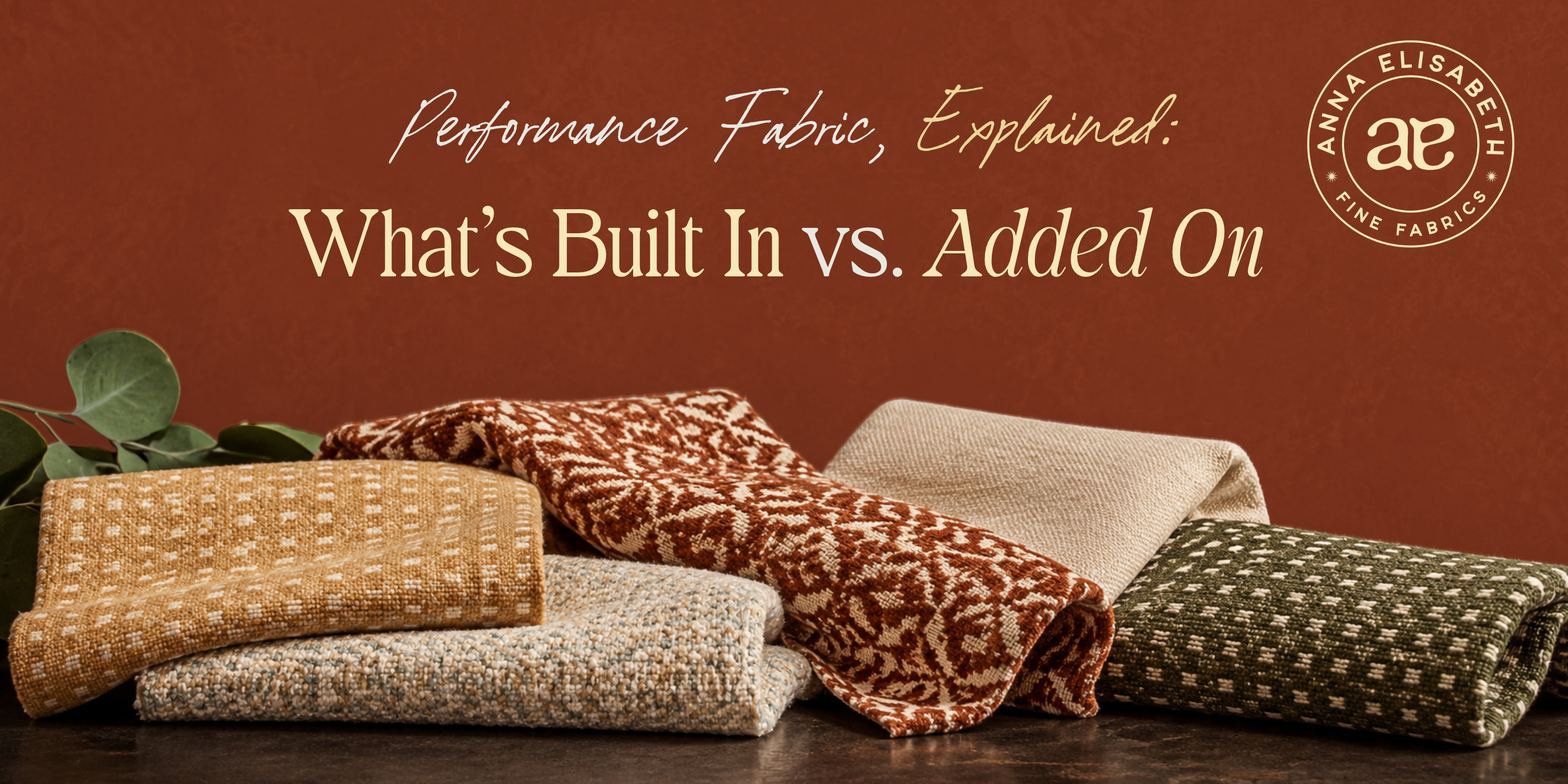
Long before you can explain why a palette works, you can feel that it does. A room asks for warmth, a corner needs to settle, a scheme sits one shade from right — and you adjust, often without naming what you're doing. Color theory is simply the language for that instinct. It won't change how you work, but it can give words to the choices you already trust.
What Color Theory Actually Is
At its heart, color theory is the study of how colors relate — how they mix, how the eye reads them, how they shape the feeling of a space. Most of it you already sense; what naming it adds is confidence, because once you can say why a pairing works, a selection stops feeling like a guess and starts feeling like a decision.
The Color Wheel, as a Map
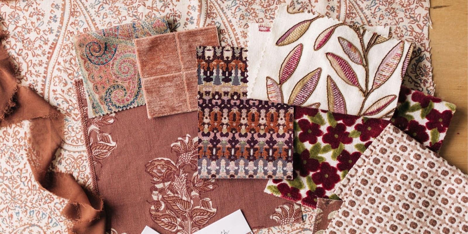
The wheel is the quickest way to see how colors relate. Complementary colors sit opposite one another, like blue and orange — used sparingly, they bring contrast and life. Analogous colors sit side by side, like blue, blue-green, and green, reading calm because the eye moves easily between them. Triadic schemes use three colors evenly spaced around the wheel — balanced, with a little more energy than a single family. You'll recognize all of it the moment you see it in a well-built pattern, where the fabric is often doing the color theory for you.
How Color Shapes the Feeling of a Room
Color carries emotion, and this is the part you likely feel before you'd think to explain it. Green tends to quiet a space, which is why it settles so naturally into rooms meant for rest. Yellow does the opposite, lifting a room — though too much can tip toward restless. None of this is a rule so much as a set of tendencies, something to lean into or push against depending on what the room is asking for.
Naming What You Already See
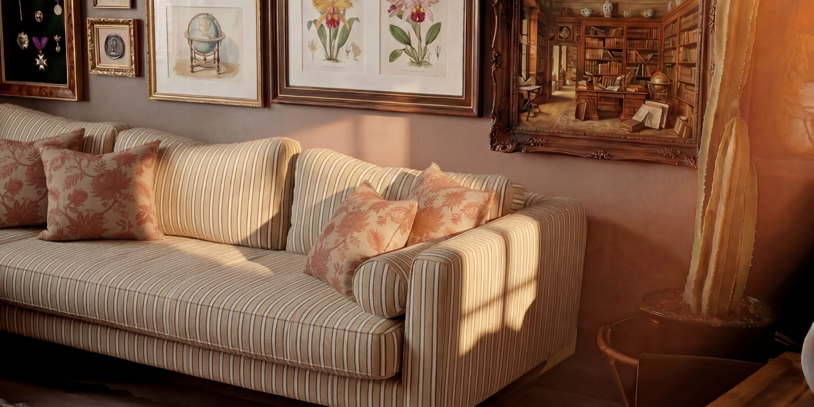
There's a quiet power in being able to name it. When a client describes "a blue room, a green room, and a neutral room," you might already notice the grey running through all three — the thread that ties them together. Putting that into words does two things at once: it sharpens your own reasoning, and it lets the client see what you see. The fabric was always right; the language simply makes the why visible.
The Closest Look Is in Person
For everything color theory can explain, color still has to be met where it lives. A shade shifts with the light, the wall beside it, the hour of the day — the things a screen quietly flattens. So when a decision matters, a memo is the surest way to know: the true color, in the true room, before anything's final.

We believe the best color choices aren't the ones a wheel approves, but the ones you've seen, felt, and can stand behind. Order a memo, and take the closer look.